

Display settings let you choose how much information Pulse shows and how that information is arranged.
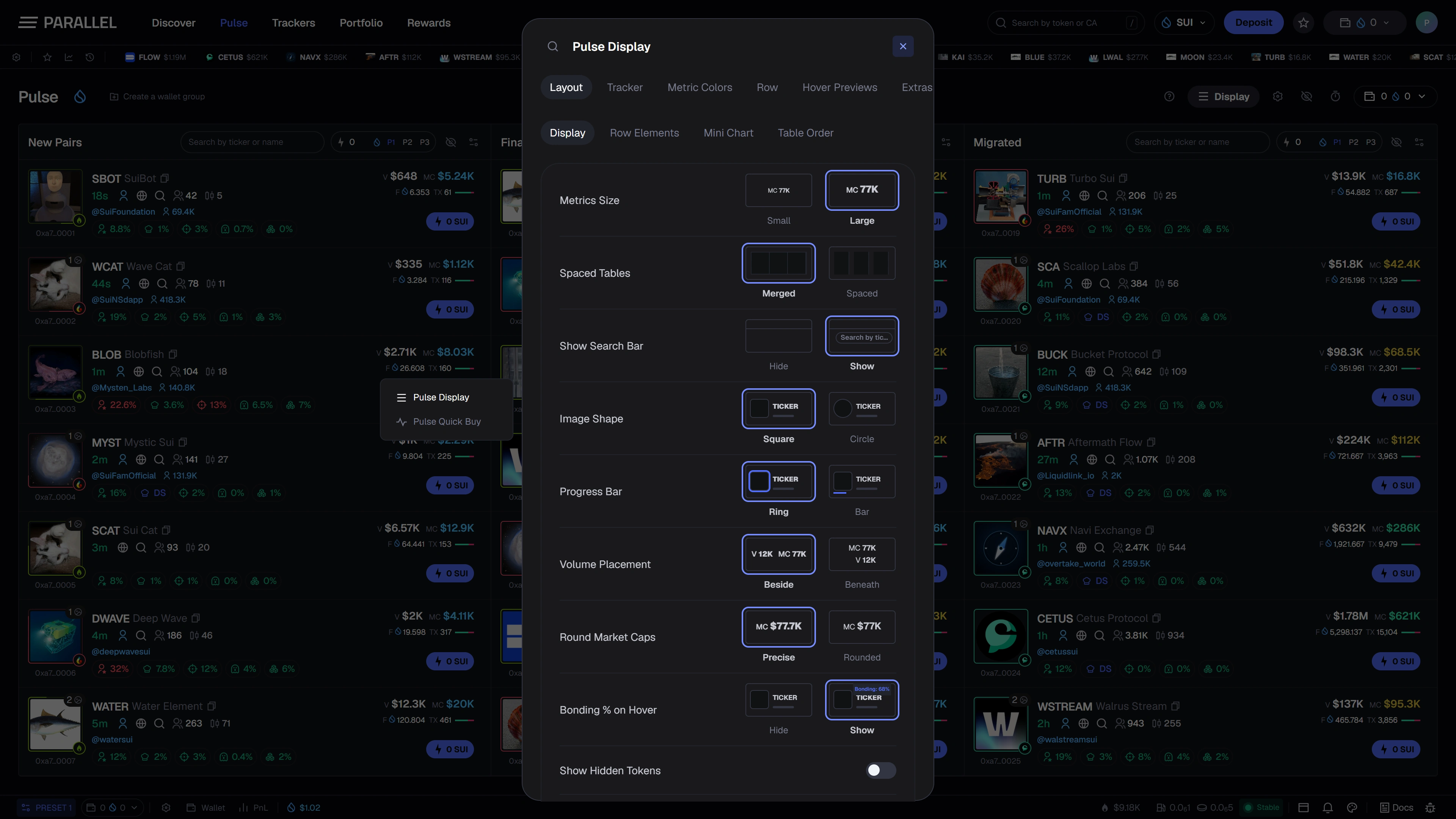
Choose the layout
Open Display from the Pulse toolbar. The design includes controls for column order, visible feeds, row density, and the elements shown in each row.
A compact view emphasizes scanning more rows. A more detailed view gives individual metrics and labels more room. On smaller screens, feed tabs provide access to each stage.
Choose visible row details
Use the available options for names, artwork, social details, holder indicators, transaction information, and other supported metrics. Cover shape and progress treatments affect presentation rather than the token itself.
Hiding a metric does not remove its underlying data. Showing a metric cannot supply a missing data source.
Set meaningful colors
Metric thresholds and colors help you recognize the ranges that matter to your workflow. Use a consistent meaning across the workspace so the same color does not imply conflicting things.
Custom colors are personal display choices, not risk ratings supplied by Parallel.
Hover details and labels
Hover-preview controls change the extra context shown around a row. Tracker label modes change how wallet activity is presented. Review both alongside the main feed layout.
These screenshots show the interface being prepared for launch. Preference storage and account synchronization will be documented with the released account experience. See Preferences and notifications.